
Color is a powerful tool in web design. It’s not just about making a website look visually appealing; it’s about influencing the emotions and behaviors of your users. In this article, we’ll explore the fascinating realm of color psychology in web design, discussing how color choices impact user emotions and behaviors and providing tips for selecting the right color schemes to achieve your web design goals.
The Power of Color
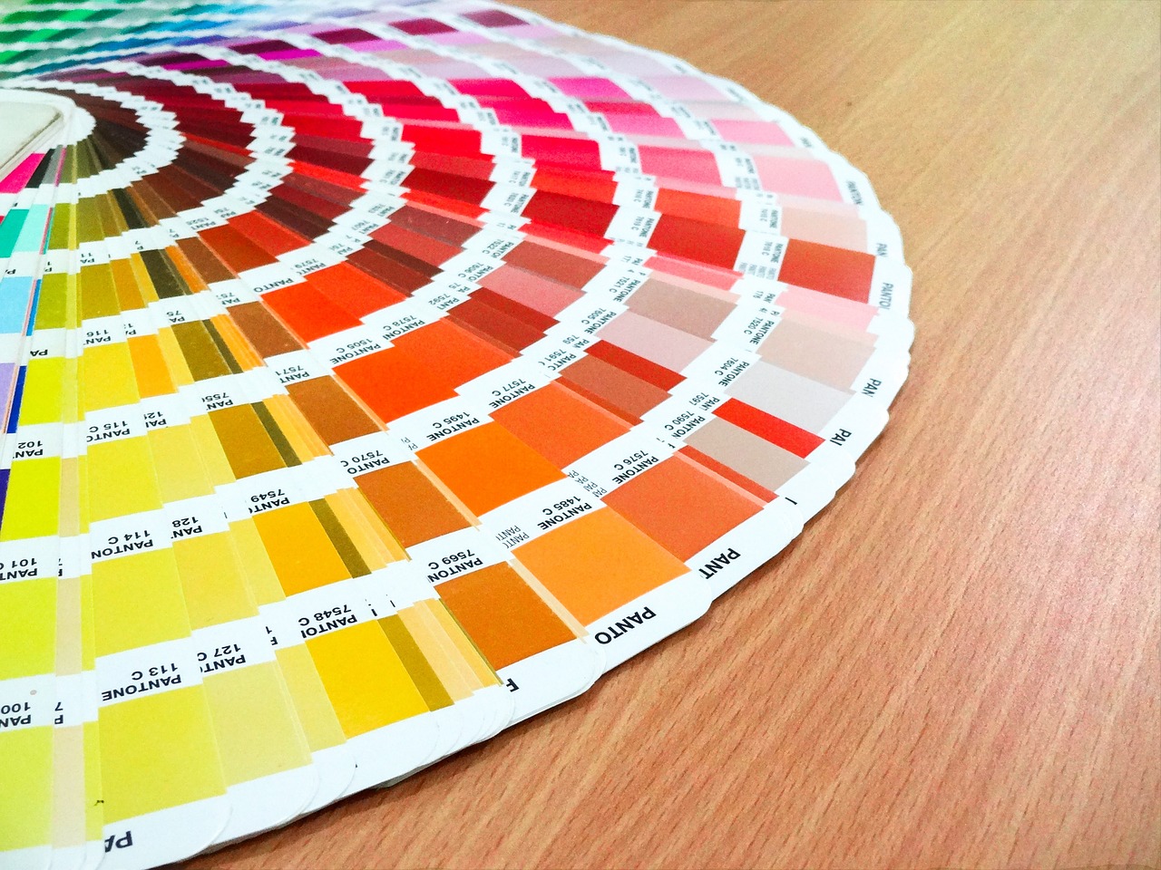
Color is a universal language. It can evoke emotions, convey messages, and even prompt actions. When used thoughtfully, color can transform a website’s user experience. Here’s how:
1. Emotional Influence
Colors have the ability to trigger emotional responses. For example:
- Red: Excitement, passion, urgency
- Blue: Trust, calmness, professionalism
- Green: Growth, health, eco-friendliness
- Yellow: Happiness, optimism, attention-grabbing
- Purple: Luxury, creativity, spirituality
2. Behavioral Impact
Color can guide user behavior on a website:
- Call-to-Action (CTA) Buttons: Using contrasting colors for CTA buttons can draw attention and encourage clicks.
- Navigation: Navigational elements can be highlighted with specific colors to guide users through the site.
- Form Fields: Colors can make form fields more inviting and approachable.
Tips for Selecting the Right Color Schemes
Now that we understand the power of color, let’s dive into some practical tips for selecting the right color schemes for your website:
1. Know Your Audience
Understanding your target audience is crucial. Different demographics may respond differently to colors. For example, a website aimed at children might use bright, vibrant colors, while a financial institution’s site may opt for more muted, trustworthy hues.
2. Consider Brand Identity
Your website’s colors should align with your brand identity. Consistency across all brand touchpoints helps build trust and recognition. If your brand already has established colors, use them as a starting point.
3. Use Color Harmonies
Color harmonies, such as complementary, analogous, or triadic color schemes, can create visual harmony and balance. Tools like Adobe Color Wheel can help you find harmonious color combinations.
4. Balance and Contrast
Ensure that text and background colors have sufficient contrast to ensure readability. Low contrast can be frustrating for users, especially those with visual impairments.
5. Limit the Palette
While a variety of colors can be exciting, too many can overwhelm users. Stick to a limited color palette (typically 2-4 primary colors) to maintain a cohesive and visually pleasing design.
6. Test and Iterate
Color preferences can be subjective, and the impact of colors can vary. Conduct A/B testing to evaluate how different color schemes affect user engagement and conversions. Use analytics to inform your color choices.
7. Cultural Considerations
Remember that the cultural context can influence color associations. Colors may have different meanings in different regions, so research your target audience’s cultural preferences.
8. Accessibility Matters
Ensure that your color choices consider accessibility standards, such as providing sufficient color contrast and accommodating color-blind users.
In conclusion, color psychology in web design is a powerful tool for influencing user emotions and behaviors. By understanding the emotional impact of colors and following these tips for selecting the right color schemes, you can create websites that not only look visually appealing but also connect with users on a deeper, emotional level, ultimately leading to a more successful online presence.