

Responsive Website Design.

With over 295m smart phone users in the US alone, can you afford not to have a mobile-friendly website?
With more and more smart phone users every day, it is becoming more important than ever to have a responsive or at least, a mobile-friendly website. It is said, that in years to come, most people will not even have a desktop computer and solely browse the Internet from their smart phone. Our research with smart phone users shows that the tendency to leave your website is 95% if the website is not mobile optimized or has at least, a click-to-call phone number.


What are responsive websites?
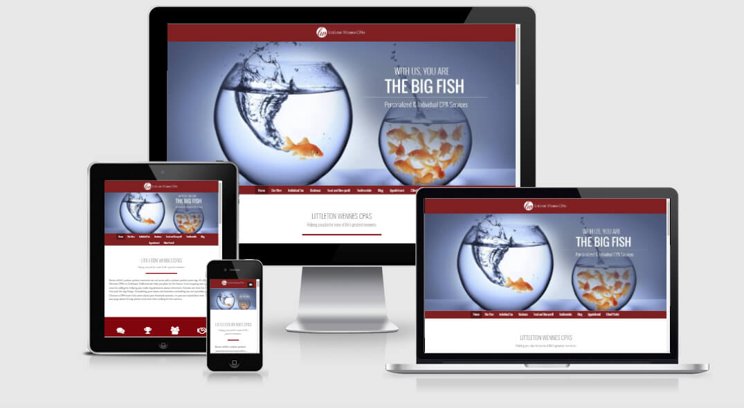
Responsive websites are websites that scale to the device from which they are being viewed – also called adaptive websites. The website content is scaled to have less width and in most cases a collapsible menu or larger menu buttons to accommodate the size of a finger for the individual buttons. The layout changes and starts stacking the content vertically, so all content of the website is still there. Animated slide shows are usually achieved though JavaScript in comparison to the non-mobile friendly flash animations. In some instances, the slider is disabled when viewed on the smaller devices to save data usage.
Essentially, a responsive website will have all the content, sidebar and footers etc. in comparison to a separate mobile site which is usually a stripped down version of the main website.
Scales to Mobile Device
Finger friendly easy navigation. for any device width.
Speed
Faster loading times. Smaller images, optimized structure.
Click-to-Call
Click-to-call phone number for easy mobile conversions.
What are other advantages of scale-able websites?
If you own a Facebook business page, you might have seen some of the mini-websites or landing pages some companies have. Most websites are coded in a 960px width which would make them too large for a Facebook mini-site. With a scale-able website, you are able to insert your responsive website into your Facebook page and only pay a small fee for the set-up instead of having to have a separate website built.
No need to maintain two websites: in comparison to a responsive website, a separate mobile website will require you to maintain and update your content in both websites.
Why are responsive websites more expensive?
From a coding and designing aspect, responsive websites have to be designed and styled for five screen views – full size, tablet size (horizontal and vertical) and smart phone size (horizontal and vertical). While certain parts scale easily, others need more code to be positioned right for each view and therefore create many more hours of coding.
Older browsers are not compatible.
Responsive website design is the newest technique in web design as well as HTML5 and CSS3. Older browsers like IE5, IE6, IE7, IE8 might not be up to standard for displaying these sites properly. As it is a security risk to run old browsers, we urge you to update your browsers to keep your information safe.

You already have a nice website but still want to be mobile-friendly?

If you already have a fully built website that you like, you have the option of having a mobile website built. Mobile websites offer the possibility of a landing page, letting your visitor choose which version they would like to see. A mobile site is usually a stripped down version of a desktop site and has a simpler design to it.
The mobile site will be hosted in a separate folder on your domain, so your url would be something like www.mydomainname.com/mobile. That means that mobile sites have to be maintained separately to your desktop website. The upside of these sites are that you can allow visitors to switch back to the desktop version at any time.
Samples (please, view on a mobile device)
 Call Today